Livestrong apple watch application
Wearable user experiences design | Role: UI/UX designer
Summary
Summary
The primary purpose behind to make this app is to keep User notify about their meal plan, how many calories they burned throughout the day and Water intake tracking. This application gives the user a summary of breakfast, lunch and dinner meals, so the user doesn't need to check mobile app every time. Also if the user is doing cardio, it tells the user how many calories they burned, and this data saves in the mobile application so the user can see the progress in their goals.
Livestrong is Health and fitness Mobile app, the Apple watch version sync all data from the mobile app and provides a user, information about the meal plan, workout tracking, water intake track, and calorie tracking. These notification keep motivating user to achieve their goal.
Storyboarding
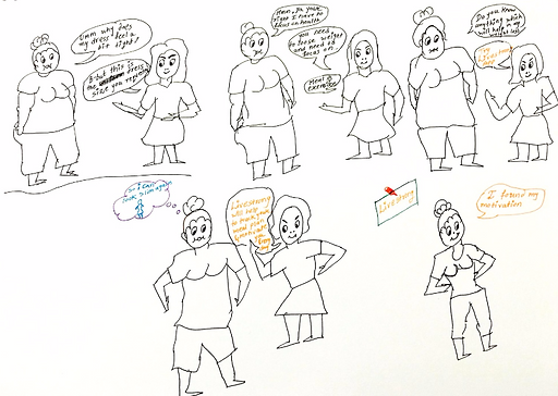
Meet Peggy,
Recently she gained weight, and she doesn't fit in her dress, She is depressed, and doesn't know how she should lose weight and live a healthy life. She needs a personal trainer who will guide her about diet plan, and keep motivates her to achieve her goals, but that is very costly. She can't afford that much money for personal training.
Then her friend Caroline suggest her to use the Livestrong app. She told her that she needs to put her Personal information, e.g., weight, age, and how much weight she wants to lose.
Livestrong app will guide her with a meal plan and workout plan according to her goals.
I saw the Problem
Challenges
I often wondered if there was a way to make the user better prepared for their goals with information on-the-go or enable them to make their meal before the lunch dinner and breakfast.
General observations…

What should I eat?

Why can’t I see all the info in one place?

How should I track the calories?

Users are unaware of the food what they need to eat. which has low calorie and still its tasty and fulfill the hunger
Tracking calorie is a headache because it is difficult to count calorie through portion you have eaten during the day.
Tracking calorie is a headache because it is difficult to count calorie through portion you have eaten during the day.
The user doesn't remember how much water they have drunk throughout a day. Difficult to track it.
How should I keep hydrated?
So I decided to jot down all the pain points I observed…
Brainstorming
Discovery
A quick card sorting exercise revealed patterns that the queries could be classified into.
Meal Track
Water intake Track
Exercise Track
Weight Track
Calorie
Count
Caloric
Breakdown
Daily
Routine
Meal
Plan
track
Water
Intake
Cardio
Exercise
Calorie
Burn
Notification
Exercise
Count
Few data collected from discussion
UX Strategy Blueprint
- Simplifying the process of being healthy
- Heavy Content and minimalistic design with easy navigation
Challenges :
Aspiration:
- Intuitive and easy to UI
- Healthy lifestyle on the go
- Positively,
- Daily changing meal plan
Focus Area:
- Present health Statistics
- Achievement of Users goals in particular time frame
- Detail design of each screen
Guiding Principles:
- Providing user's with time to time notification
- The user should use the apple watch to follow exercise and meal plan
Activities :
- Continous Design
- UI Designing
- Design Strategy and Product Planning
- User Research
Measurements :
- Tracking the success level of user-health goals
- Duration of Application Use
- Number of application use
- Encouragement
Ideation
Setting the Page Navigation Flow
Landing page
Choose
Symbols
Button
Screen
Choose
Option
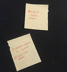
Weight Track
Adjust Weight Count
Save data
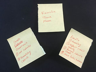
Exercise Track
Mins Countdown
Start Cardio
Heart beat rate
Set Calorie goal
Start/End
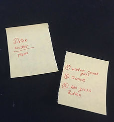
Water intake Track
Water intake screen
Add Glass
Notification Screens
Daily Routine
Update weight
Add Water glass
Calorie
-Consumed
-Remaining
-Burned
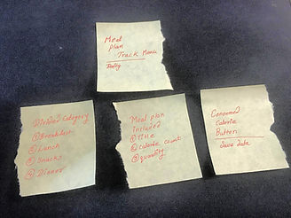
Meal Track
Screen
Breakfast
Lunch
Snacks
Dinner
-Meal
-Calorie
-Quantity
Consumed Calories
Cal
consumed
Wireframes
Solutions
Setting the user flow and sitemap helped me to sketch actionable wireframes. I explored multiple patterns to make information accessible to use, minimize steps towards the end goal (Exercise track) and keep the interactions user-friendly. Those wireframes helped me to identify the placement of context, navigation, and others. The iterations in the design process led to placements changes from the initial sketch to high fidelity prototypes.
After many iterations, I created an apple watch wireframes from low fidelity to high fidelity.
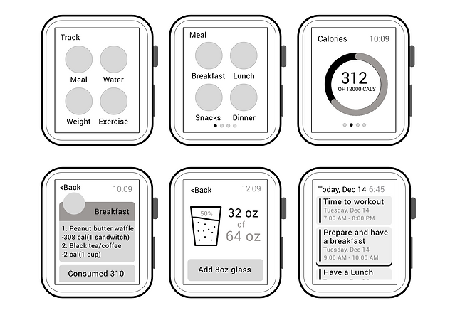
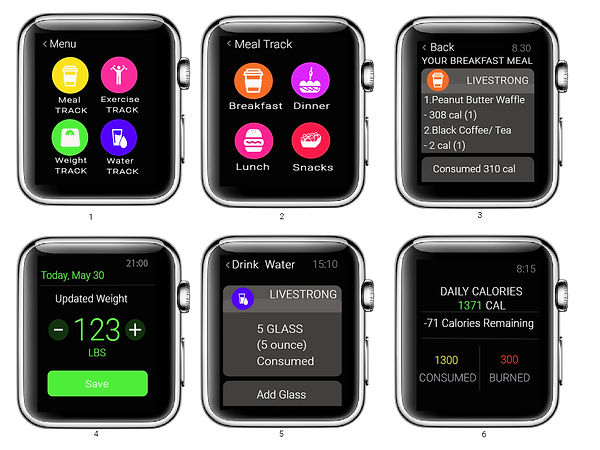
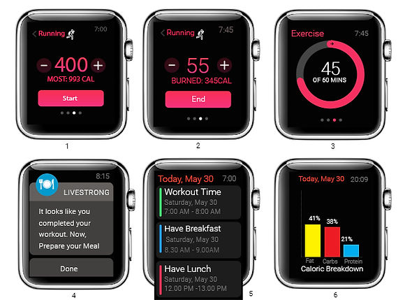
Prototypes

1- Select Menu
2- Meal Menu
3- Meal Plan sample
4- Weight Track
5- Water track
6- Calorie count notification