20 Pop Workout Mix
CD Cover Design | Role : Graphic Designer
Brief
PROJECT DETAILS
I am not exercising person but keeping a healthy life we need to work out. Pop work out always encourage me, help me while I am doing exercise in the gym. So, I had chosen the Pop workout music for the final CD package project since that is one of my favorite music. Shake it off, is an American Pop workout mix which is from 2015 songs where I had added my Favourite songs.
DESIGNS
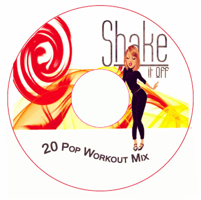
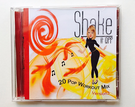
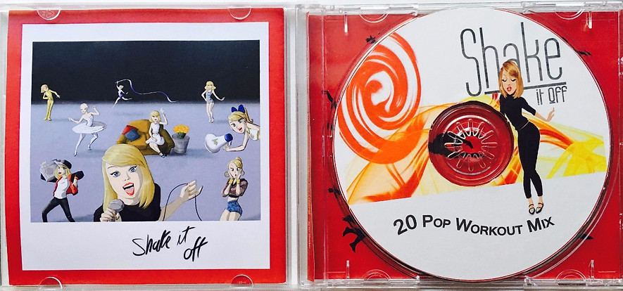
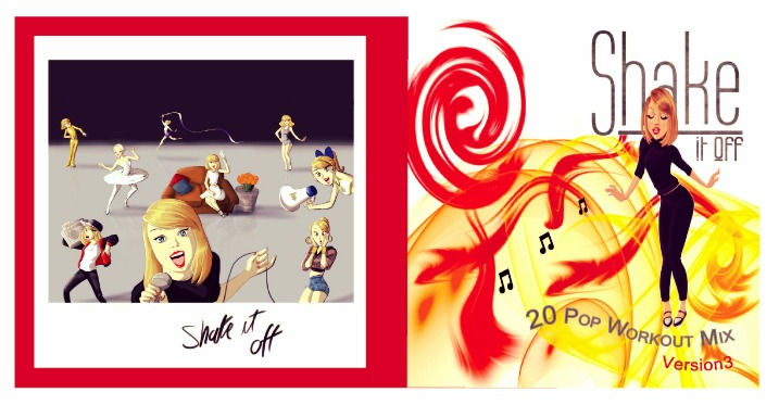
I came up with multiple design ideas for the CD Cover Booklet and the U Card and finalized on one design the image with Tylor swift because the cd title is "Shake it off" which is Tylor Swift song and which most popular song on this Cd.
TYPEFACES
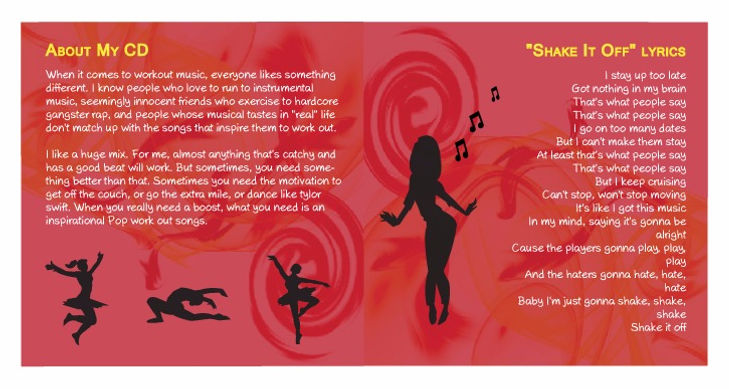
I used two typefaces for this project. For all the main titles I chose Microsoft san -serif and the list of songs on the U-Card I decided Axure handwriting. I think, Microsoft san-serif font much easier to read.
COLORS
I chose four main colors for the different pages and the text - Red yellow has a primary theme for the front page. Red, Yellow has Swirl, and it looks like everything is shaking. I had used gray for subtitles because I have white, red yellow color in the background and gray color little light color so subtitles can show easily. The reason I choose these colors because Red is associated with energy. Yellow or rather a shade of gray and white mostly goes well with the red color; also, gray and white are the colors looks bright text on dark background.
IMAGES
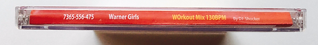
I used Photoshop to create some images and I found some graphics/photos (Tylor swift cartoon images) on the internet. I chose cartoon images of Taylor swift because it looks funny more than real images. One minor dilemma I had was whether to include the bar-code on the U-Card or not because I didn't want to spoil the look and feel of the U-Card. However since all CD's have barcodes on their U-Cards, I finally decided to include it for a more professional/finished-product look. I tried many different permutations and combinations with placing the barcode and chose to set it in the left bottom corner so that it balanced out the list of songs and did not spoil the look of the U-Card at the same time.
PRINTING
For printing the booklet, u-card, and the cd-sticker, I used a glossy 30 lb laser printing paper. I did the printing in printing services (Inksmith mountain View).
Front and Back Cover
Inside the CD
Inside the CD -U tray